Artventure
Research UX Design Prototyping
A Seattle Art Museum (SAM) gallery app that takes users on a tour of a chosen gallery, teaching them about the art, artists, and more.
Overview
Seattle Art Museum’s strategic goals
In 2018, the Seattle Art Museum reported the strategic goal “to capitalize on opportunities with younger and potential members.” This drives the objective for the week, which is to enhance in-gallery engagement by utilizing technology to engage audiences and deliver relevant content.
Overall design approach
Role
Sole Designer - User Research, Sketching, Wireframing, UI Design, and Prototyping + Iterations
Tools
Figma, Good ‘ole pen and paper
Timeline
1-week design sprint
DAY 1Understand
Defining the user base
Capitalize on opportunities with younger and potential new members
The strategic goal drove my initial research where I detailed target users as people under 40 interested in the arts and had visited a museum in the past 12 months.
Research goals
Understand user desires
When attending the museum, understand the users’ goals, desires, and frustrations.
Observe technology usage
Identify how users are interacting with their own devices at the museum.
Research insights
Uncover current processes
Discover strengths in what technology is currently in place and seek opportunity areas for growth.
Research approach
Contextual inquiry
I went to the Seattle Art Museum to observe and casually chat with museum attendees to see how they interact with technology in the galleries. I was excited to discover a virtual tour of the latest exhibits. However, my excitement quickly turned to frustration as I struggled to navigate the experience. To make matters worse, I was the only one out of 20 people in the gallery attempting to use it.
User interviews
I utilized the compiled research from Bitesize UX and pulled insights from the seven target users. They were asked, “Tell us about a recent time you attended an art museum or gallery.” Based on my visit and user interviews I compiled the following insights.
Online information can be overwhelming and too detailed.
Nearly 30% of interviewees actively sought out additional information about the art either before or during their visit. However, they expressed frustrations with lengthy articles and the need to do additional research once in the gallery.
Visitors use their phones only for photos and research, not the existing virtual tour.
2 of 5 interviewees admitted to doing their own research on their phones while at the museum. Additionally, people were only using their phones for additional research and to take photos, based on the observation of 20 museum visitors.
Users want to learn about the artist, their techniques, and their inspiration.
5 of 7 interviewees expressed a desire to learn more about the art beyond what is provided on the museum’s website or posted on the piece’s gallery label.
Based on these insights, how might we enhance the experience and provide visitors with bite-sized and interesting information about a piece's history, techniques, and materials when viewing art at a museum?
Mapping out ideas
In response to users' desire for a more enriching gallery visit, I drafted two potential journey maps, leveraging user/product goals and my best assumptions to help users dive deeper into the art through bite-sized and relevant information.
User goals
Learn about the artist, their life, techniques, methods, materials, and fun facts!
Product goals
Encourage visitation and engagement.
Encourage and promote inclusivity through design.
Constraints
Mobile app or mobile optimized design.
Wifi/cell service is abundant.
1
Navigate to the app
Scan a piece of art
Information pops up about the piece
The user reads and expands information to learn more
Repeat as the user walks through the gallery
2
Navigate to the app
Select a tour
Follow the directions to art pieces
Expand information to learn more
Repeat until tour is complete
A path forward
Both options below effectively address the research insight that users crave additional information and context about the art. However, Option 2 provides a more comprehensive end-to-end experience, while Option 1 is more fragmented. Considering this distinction, I chose to move forward with option 2, an augmented reality virtual tour of an art gallery.
Option 2 better enhances engagement before and after visiting SAM.
DAY 2Diverge
Sketching the concept
Designing for an AR environment, I drew inspiration from the interactive elements found in Pokemon GO, integrating a perspective walkway and interactive floating elements into my design. Furthermore, the plant information displayed in the PictureThis - Plant Identifier app resonated with my vision for showcasing art information.
Crazy eights
The most critical interaction is how a user would follow the virtual tour to find information about the art, so I spent 8 minutes sketching options for this screen.
I focused my attention on the ideas that exemplified the principles of contextual guidance and efficiency. Notably, the seventh screen offers a clear interface that minimizes unnecessary steps and interactions. Drawing inspiration from the second, fifth, and sixth screens, I incorporated a perspective walkway to emphasize contextual guidance. As shown below, I built upon these screens to further conceptualize the user flow.
DAY 3Decide
Converging the sketches and ideas from the past two days
I created a storyboard of the experience to visualize the user journey and further define and visually represent how a user interacts with the app. This showcased the key steps and touchpoints along the way.
DAY 4Prototype
I dove into wireframing too fast.
I developed a rough Figma prototype of my conceptual design for testing on the final day of the sprint. Upon reflection, it would have been smarter to prototype with hand sketches, especially due to the expedited timeline. This would allow me more flexibility to change the designs without worrying about the UI being pixel-perfect for testing (which it didn’t turn out to be anyway, see below.)
Taking a step back
Instead of jumping from a storyboard straight to low-fidelity wireframes, I should have spent time working out the UX goals for each screen in the experience. Since I skipped sketching these steps, I spend exorbitant amounts of time designing and re-designing screens in Figma. Between the first round of testing and the second, I had to take a step back and pulled out my pen and paper again, as seen below. I refocused on the design goals and sketched the ideas before updating them in Figma.
By leveraging hand sketches in future projects, I can avoid wasting time while still refining and implementing feedback.
DAY 5Validate
Iterations and the final solution
My rough prototype may have been a blessing in the end because users had a lot to say during our two rounds of testing. After testing, I synthesized three major insights and went back to the drawing board to iterate.
1
Saving Information
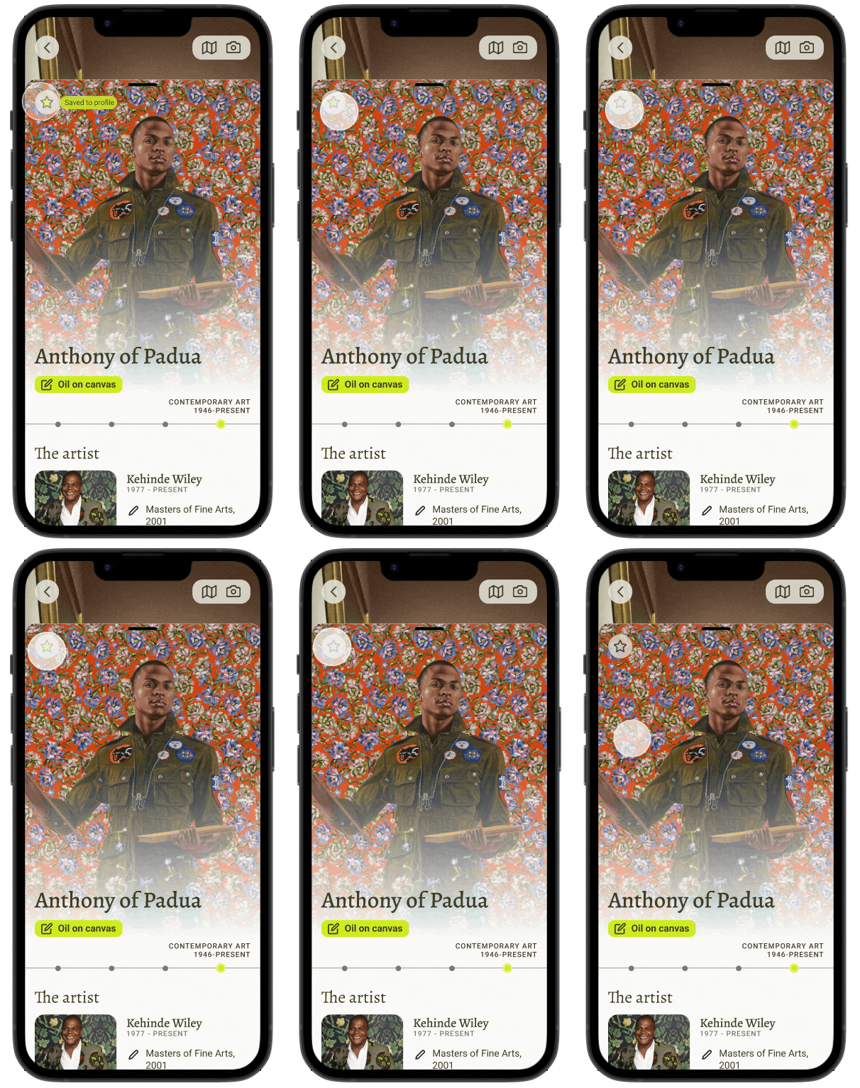
Three out of five users were unsure about how the "save" the art information and it would be stored in the app.
Outcome
Enhanced profile interaction with visual feedback. Added a tour overview including user photos after completion.
2
Scrolling/Interaction Issues
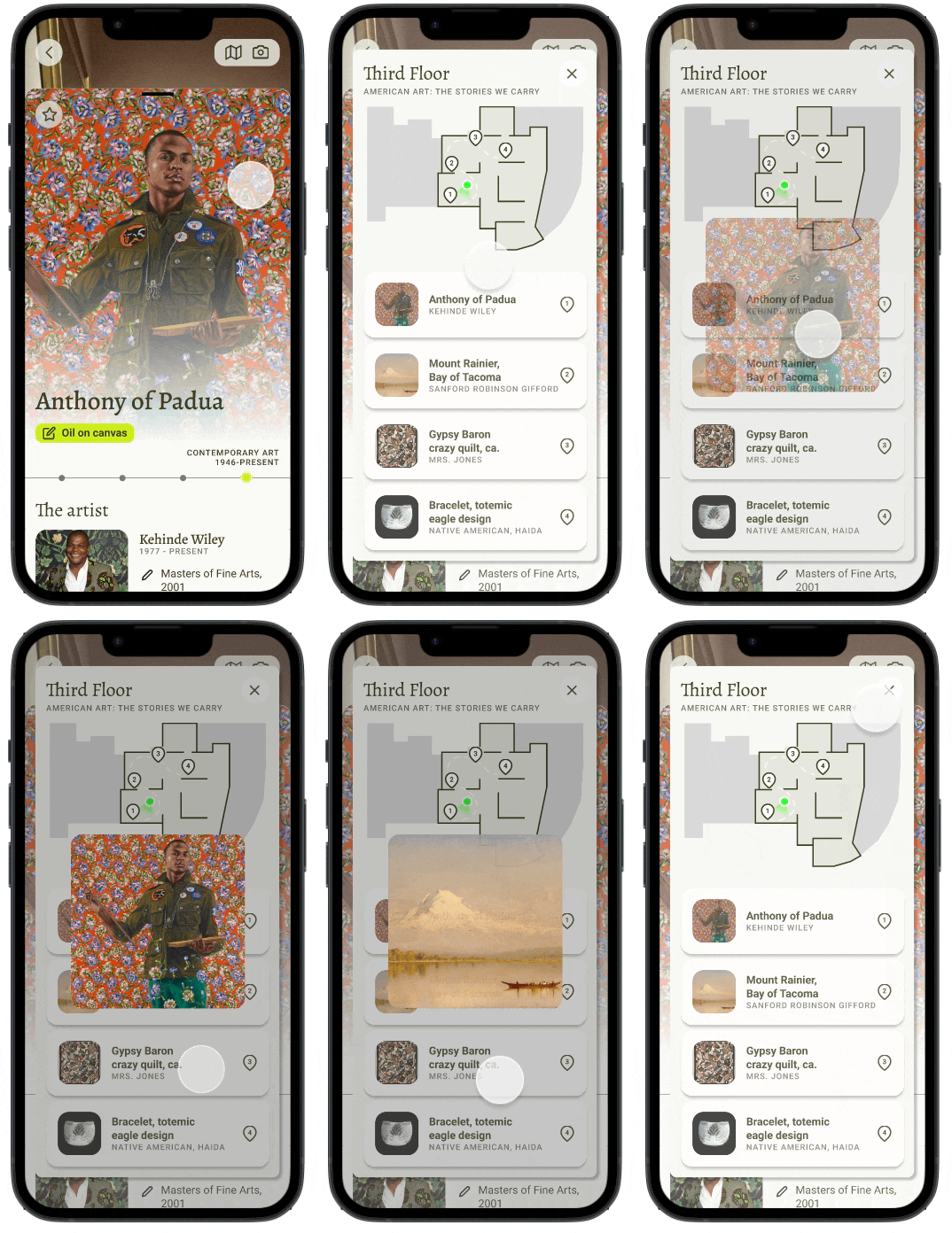
All users wanted to know what happens after the tour ends and how to navigate back to the home page.
Outcome
Audited and improved back button functionality
3
Accessibility Concerns
Two out of five users had difficulty understanding where they were “walking” due to small photos.
Outcome
Added an option to expand photos for improved navigation.
The final product
Reflection
This product could do a lot more
A blind spot of this design project was the design did not focus on accessibility. This product could be expanded to serve better museum visitors who are hearing or vision impaired. In the future, I would hope to integrate verbal descriptions of the artwork or low light and visibility UI, for example.
Don’t skimp on sketching
Wasting time and resources on even low-fidelity wireframes can be costly. I learned that hand sketching is my best asset to iterate newer design concepts as it is quick rapidly.
Historically, U.S. art museums have predominantly represented artists who were male and white, as documented by Chad M. Topaz et al. in "Diversity of artists in major U.S. museums."
In pursuit of inclusivity, the design of this product should align with the user, product, and museum goals while emphasizing cultural representation and amplifying the voices of minority artists.
I chose to highlight Kehinde Wiley in the prototype. He is an African-American painter who restages classical portraits and sculptures.
A note on inclusivity
Written and executed by Erika Kissler
Thanks for being here! If you’d like to talk further please reach out.


