Yard Sale
UX Design User Research UI Design Prototyping
Yard Sale is an app-based marketplace for selling used winter sports equipment. This project documents my process of conceptualizing the app and designing a user quiz feature to improve gear discovery.
Overview
Winter sports are notoriously expensive.
A complete set of ski gear including skis, boots, bindings, poles, helmet, goggles, and appropriate clothing can range from a few hundred dollars to over a thousand dollars.
Many people turn to buying resale gear to help alleviate the cost burden of winter sports. According to Snowsports Industries America, nearly half of ski, snowboard, and cross-country equipment buyers purchased used gear due to the exorbitant cost of new equipment. With this many people searching, there has to be an effective way to find affordable gear online.
Design objective
Develop a captivating online gear search experience that prioritizes cost-effectiveness with valuable gear recommendations.
Approach
Role
User and industry research, component development, usability testing, and prototyping.
Tools
Figma, Miro, Marvel, Photoshop, Adobe Illustrator, Canva
Timeline
6 months
Research
Understanding the market and users
The Market: The competition has a lack of organization and relevant inventory.
Powder7
Skiing focused only
No snowboarding or other winter sports gear
Gear Trade
Cluttered navigation
Filtering is a nightmare
Reoccurring site errors
Facebook Marketplace
Minimal searching options
No ability to filter
Limited inventory
Insights
I found GearTrade.com to have the most inventory, but it had usability issues. There's a gap in the market for a user-friendly platform for winter sports gear, which is an opportunity for me to create a solution.
User Interviews: Of five interviewees, all had challenges finding gear because resale sites were unorganized.
I employed screeners to recruit users who had purchased ski or snowboard gear online from a resale website such as geartrade.com, ebay.com, or Facebook Marketplace within the past year.
Research Objectives
Understand how users are currently buying used gear.
Identify friction points in the gear-searching experience.
Uncover why people purchase used equipment.
Research Questions
Can you tell me about your most recent experience with purchasing used/resale gear online?
How did you conduct your search, where did you start?
Tell me about a time you searched for gear and couldn't find what you wanted.
How did you feel about the overall experience?
Synthesizing the interviews
Due to the quantity of information gathered, I built an affinity map and uncovered three major themes.
Interview insights
Users want to be able to eliminate the nonsense often found on resale sites.
Price is the primary motivation for all users when buying resale gear.
Users want to feel like the app is trustworthy and knowledgeable.
How might we help our users better find gear they’re looking for?
Ideation
Exploring design solutions
Ideo brainstorming rules guided my brain dump (pictured below).
I decided to move forward with a user quiz. This option best address the pain point of an endless scroll through products and shows the user best match recommendations.
Proposed solution
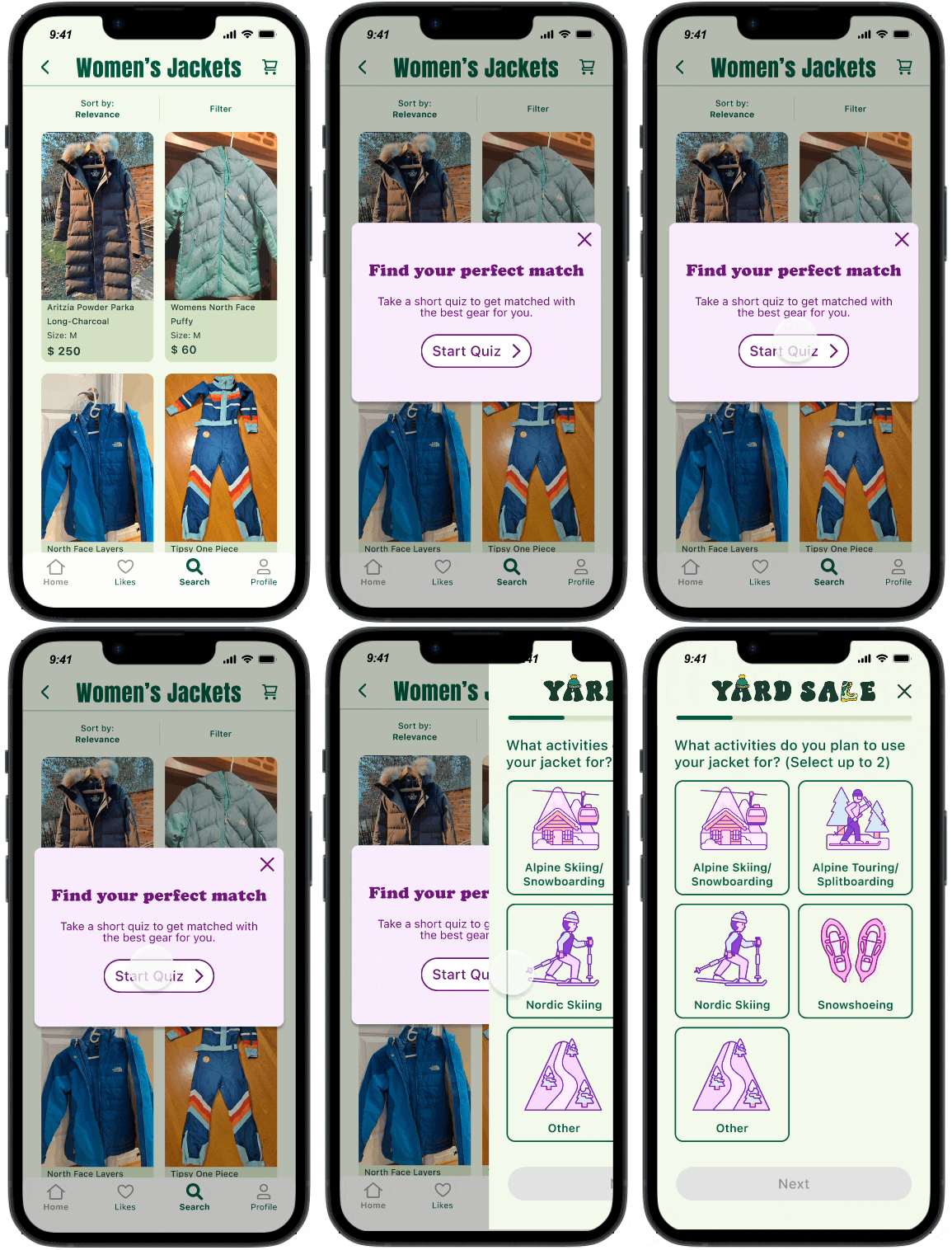
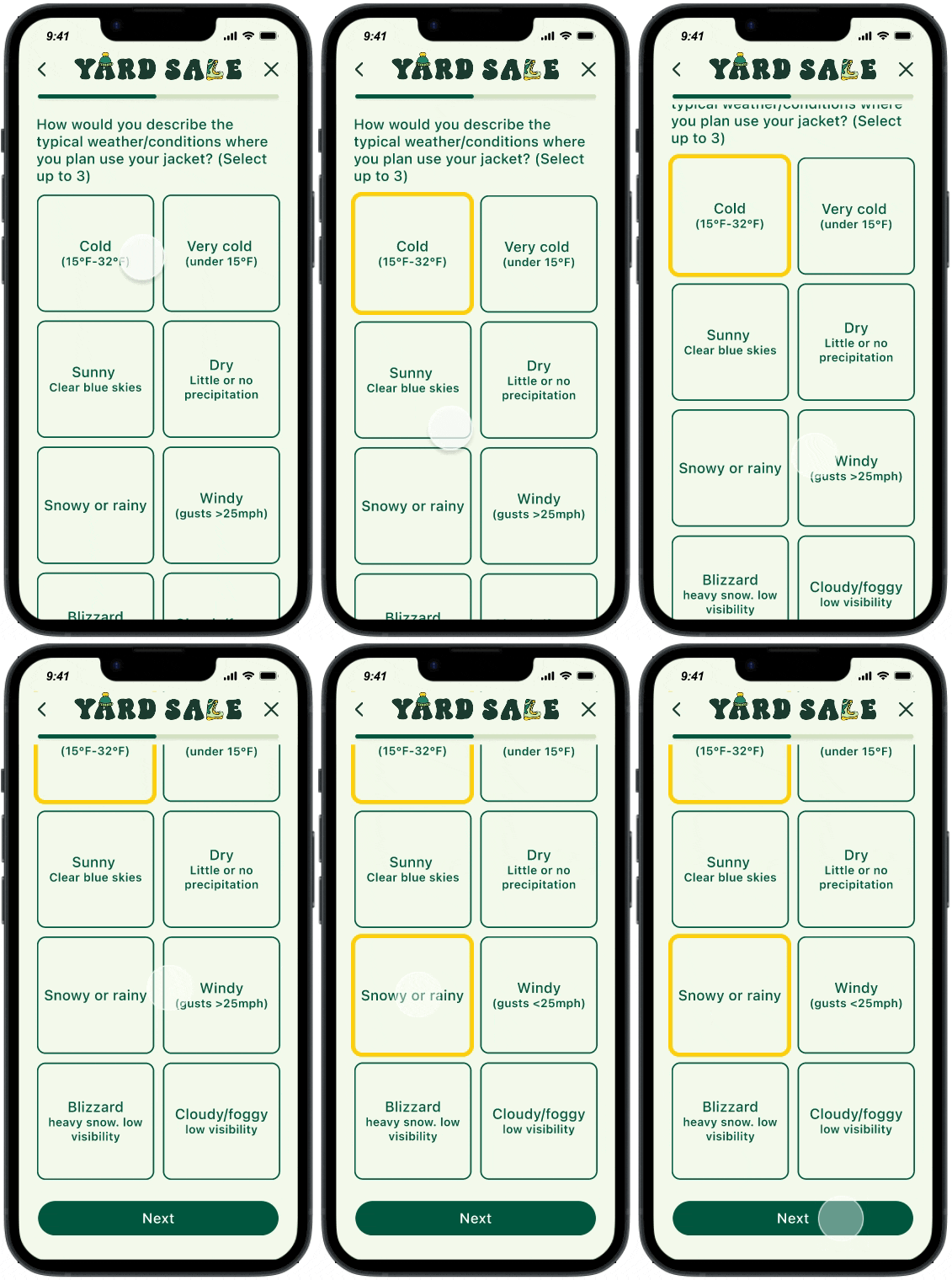
When a user scrolls on a product page the app will prompt them to try using a quiz to help them narrow down their search. The user then answers a series of carefully picked questions to help apply filters and suggest the best-matched gear for them.
Sketching and guerilla testing
I considered two potential routes based on product types and performed guerilla testing to obtain quick user feedback. The testing involved evaluating two entry points.
1. Stagnant button
2. Pop-up
Outcome
Three out of five users agree, “If I saw this pop-up in the app, I would immediately exit.”
Do I prioritize user preferences and eliminate pop-ups or keep them for business objectives?
I decided to continue with a pop-up because it is attention-grabbing. Merely keeping the quiz on the page does not guarantee success in terms of design. First impressions are critical to the success of any new feature.
Note: In the future A/B testing would be a better analysis method to determine the best path forward for a quiz entry point. In the interest of time and scope, I had to skip it for this project.
Design
Usability testing drove two major improvements to the design
1
Inadequate quiz content
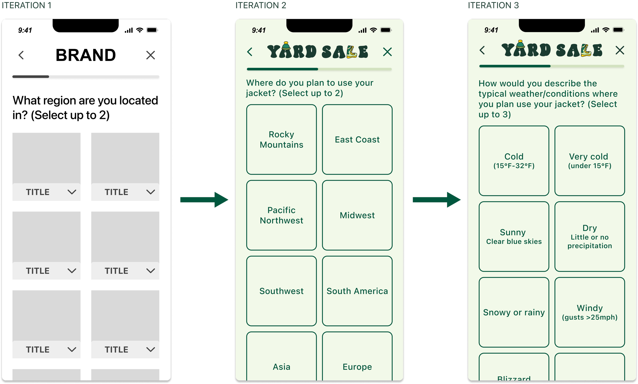
Some users felt that the question "What region are you located in?" in the quiz was unclear. I attempted to rephrase it in the next version, but users still had reservations. To address this, I revisited why the location question was necessary and reworded it accordingly.
Improvements
Knowing the location is crucial in determining the snow conditions and weather, so the final question focuses on just that. Now, the question is clear and easy to understand. It assists me in gaining a better understanding of the user's needs.
2
Quiz recommendations
Multiple users skipped over the additional information in the dropdown and explain that they would expect to see more information in the product cards themselves.
Improvements
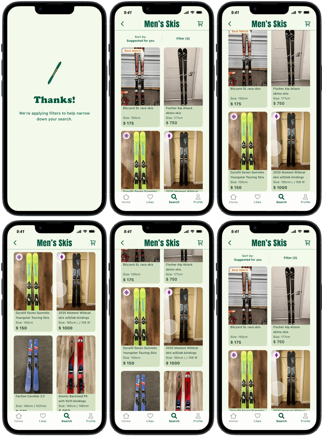
Added visual identification for product recommendations using badges.
Reduced visual clutter.
Integrated suggestions on the standard product page simplify the user flow and sitemap.
Prototype
The final product: a high-fidelity prototype
The final designs address the three significant discoverability concerns, cost, and trustworthiness.
The foundation of a resale ski and snowboard app highlights the primary concern of cost as described by the users. The quiz feature gamifies the searching experience, making it a fun and exciting way for users to find gear.
Visual design
STYLE GUIDE
MOOD BOARD
What’s next…
After my first UX project, I have a lot to reflect on.
There is no worth in developing a feature that no one will ever see. As designers, we should advocate for users in a business case, but sometimes it's not what’s best for the business goals and success of the product. For example, a pop-up might create friction for some users, but exposing them to new features is necessary.
Conversations with users are invaluable and quite fun as well! By discussing what was truly important to them when buying gear and the challenges they faced in finding the right gear, I gained valuable insight to drive my design decisions. I based the content of the quiz questions and answer options almost entirely on their input. While users can apply filters themselves, everyone I interviewed appreciated the idea of a personalized selection, which achieves the user and product goals.
Next Steps
I view this project as the minimum viable product (MVP) for a user quiz feature. Customers may take more time to consider their purchase decision for high-cost items like skis or snowboards, so a 30-day conversion rate may be an appropriate metric to gauge the feature's effectiveness.
If it is successful, there is potential to expand upon it and improve how informative the content is. For example, the quiz could help teach users how location, snow condition, and skiing style may affect their gear choices.
Written and executed by Erika Kissler
Thanks for being here! If you’d like to talk further please reach out.


