Socialite
Usability Testing User Research Web Design
An app that connects food and drink enthusiasts with events in their city. The project aimed to increase event attendance by improving the conversion rate of accepted invites.
Overview
Challenge
The number of people who say they are going to an event is significantly higher than those who attend. On average, 20% of people who say they will attend events.
Business goal
Increase the conversion of accepted invites to event attendees.
Approach
Proposed solution
Conduct a content hierarchy analysis and introduce an engaging new feature to maintain excitement and engagement throughout the user journey — encouraging attendance at events.
Role
User and industry research, usability testing, and prototyping.
Tools
Figma, Optimal Workshop
Timeline
May 2023 - August 2023
Discovery
Before diving into interviews, I researched the competitor space a bit more.
I took time to research competitors in the social events and group application space. I concluded that event information can vary widely, depending on the event organizer and attendees. Some events may be well-organized and attended, while others may be poorly organized and sparsely attended.
My main finding was that if a user can’t find information about an event, they won’t go. I saw an opportunity to analyze the presentation of event information further. I want to discover what information is most important to users and how it may affect their commitment to attend an event.
I interviewed 4 self-identified food and drink enthusiasts in my city to understand the following.
What motivates and discourages users from attending in-person foodie events?
Interview questions
Tell me about a time you found a foodie event online, reserved a spot, and attended.
How did you find details about the event?
When did you sign up for the event (how far prior) and how did you remember to attend?
Tell me about a time that you RSVP’d for an event and didn’t end up attending. Is there a reason why?
How are users interacting with technology when it comes to event registration and information?
Analysis and insights
When people search for events to attend, they are more likely to choose the ones that resonate with their interests and preferences. Factors that can motivate or discourage them from attending events include:
Attendance motivators:
1
People go to events that sound fun
Based on all five interviews, the primary motivation for attending events is "because it sounded like fun."
2
Many like to explore new things
Interviewees were eager to explore the city, meet new people, and engage in their hobbies.
3
It’s an experience with friends
60% of attendees go to events with one to two other people, while only 40% cite go to events alone.
Attendance discouragers:
1
Event information is often unclear
All interviewees emphasized the significance of finding detailed event information when they RSVP.
2
Lack of follow-up leads to a lack of engagement.
40% of users commented that they were more likely to forget about the event if they did not receive follow-up information.
3
People forget
The most common reason for interviewees not attending events is forgetfulness, scheduling conflicts, double-booking, tiredness, distance, friend cancellations, or emergencies.
Uncovering what users expect: journey mapping
When starting from scratch, it is important to understand user expectations and identify opportunities for improvement. Beyond understanding the user’s mental models I also uncovered that their excitement dwindles the most after registration.
This insight highlights an opportunity area to garner more excitement about event directly after registering.
Ideation
I considered two design problems and addressed them through How Might We questions.
How might we ensure that reminders are helpful to users?
How might we present event information clearly to engage users and motivate them to attend events?
The second one is more clear and controllable. It is more UI-focused, emphasizing information architecture, content placement, and visual designs. This is also an opportunity area to emphasize the attendance motivators.
I organized the ideas to address the HMW question in the affinity map below:
The solution approach is twofold, focusing on the #1 motivator and #1 discourager for event attendance.
Prioritize key event-related information
Ensure it is easy for users to scan and understand. Users do not attend events without proper information and details.
Introduce a “fun” incentive to attend events
Users highlighted that they attend events they perceive as “fun” so I want to include a fun element to keep them engaged.
Design
An attempted hierarchy analysis: card sorting
Objective: prioritize event-related information
Gather user insights and preferences regarding information categorization and the establishment of a visual hierarchy. The focus was on organizing event-related information and prioritizing key details.
Method
Four food enthusiasts (21+ years old) were presented with cards, each with information that may be shown on an event information page. They were then asked to group the cards based on their perceived categorization.
Introducing a fun incentive for event attendees
Objective
Test the hypothesis that a spin-to-win feature is fun and engaging! I decided to include a spin-to-win feature as it is a proven model used across many platforms. The specific prizes relate directly to the event and are redeemed at the event to incentivize attendance. I began with sketches and wireframes to integrate into the first prototype.
I learned the hard way that card sorting is not the best tool for building content hierarchy..
There was a mismatch in my research methodology and expected conclusion from the analysis. Given my small sample size, it would be more valuable to focus more on “why” than “what”. Card sorting is better suited for evaluating existing information architecture.
Time to pivot — a content prioritization study
I added probing questions to rank key information (event name, date, time, location, cost, description) by importance. Results resembled a content prioritization study, providing fresh insights into user thought processes and mental models.
Common trends
The most common categorization patterns were related to the 5 Ws (Who, What, When, Where, Why) and an additional category, How (to attend).
Two users emphasized the importance of key information, such as the event name, date, time, location, cost, and description, suggesting their prioritization.
Although statistical trends were not discernible due to the small sample size, these insights were obtained.
A key information content box was recommended, followed by content boxes organized hierarchically based on the identified categories.
Applying content prioritization to initial sketches
1. What/why - event name, description
2. When - date/time, additional dates
3. Where - location, parking, public transit options, venue map
4. How - RSVP, cost/buy ticket, refund policy
5. Who - host information, attendee information
Validation method: usability testing
As detailed in the design validation section below, I tested wireframe prototypes with nine users to determine their understanding and feelings about the spin-to-win feature.
Design validation
I tested wireframe prototypes of both the web and mobile applications with nine target users over two usability testing sessions.
Major testing objectives
Determine how the spin-to-win feature is perceived by users. The feature was tested at the end of the RSVP process to assess user comprehension and gauge their excitement.
Observed how users interact with the event page in the mobile and web applications. Uncover usability questions and concerns.
Sample from the usability testing script:
Take a moment to familiarize yourself with the interface (web) and share any initial comments or observations. What options are available to you on this screen?
What sticks out most to you as you scroll?
Consider you are planning to go to this event, what would you do to sign up for the event?
What information do you feel like you would need to know to make a decision to attend this event?
What might stop you from attending this event?
What key information did you take away from the event details, and were there any pieces of information that stood out to you?
Do you feel that there were any details missing or unclear for specific events, and if so, what were they?
Second, I’ll show you a similar interface, this time in an app.
Please take a moment to familiarize yourself with the interface and share any initial comments or observations. What options are available to you on this screen?
What sticks out most to you on this screen?
What key information did you easily identify for the event?
Can you tell me about any information that may have been unclear or missing?
Were there any specific events with missing or confusing details?
Finally, I’d like you to try and sign up for this event, assuming that you are already signed in. What actions would you take?
Explain to me what happened when you RSVP’d.
How did you feel about the option to win a prize for signing up?
Is there anything else you’d like to add?
Synthesis
I categorized the findings into 4 major categories for improvement and iteration.
1
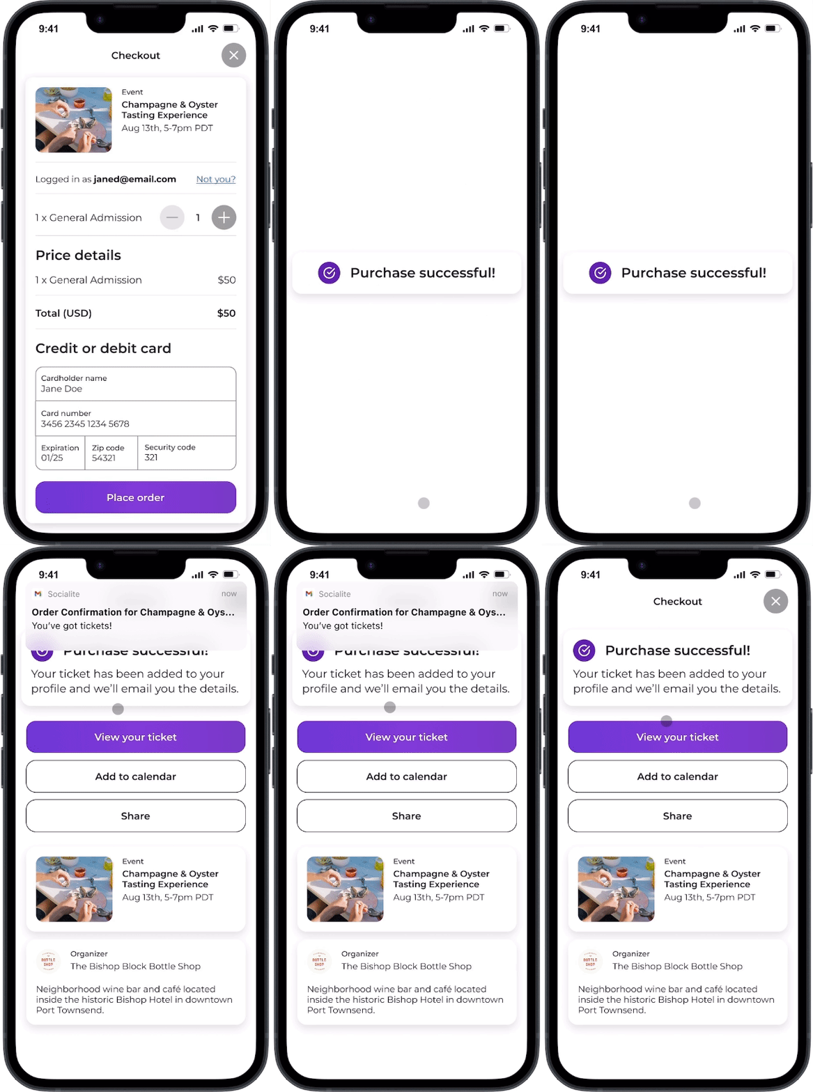
Email notification and ticket checkout is confusing
Users expressed uncertainty about whether the ticket and free prize was emailed to them or exclusively available in their profile.
Original design
Improvement: visual confirmation of purchase
Included an extra visual confirmation to ensure that purchases are fully confirmed.
Indicated how users can access their tickets and the next steps.
Re-iterated important event information, such as the date, to avoid confusion.
3
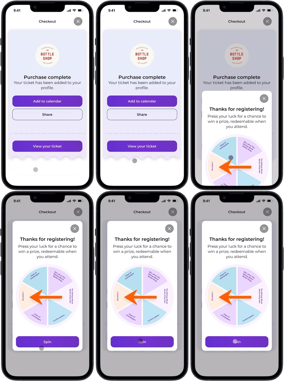
The pop-up timing is all off
Users missed the ticket confirmation before the spin-to-win feature appeared on their screen.
As a result, many users became confused, with 50% of them concerned that their purchase did not go through.
All users expressed concerns regarding accidentally missing the opportunity to redeem their prize during the prize spin interaction.
Original design
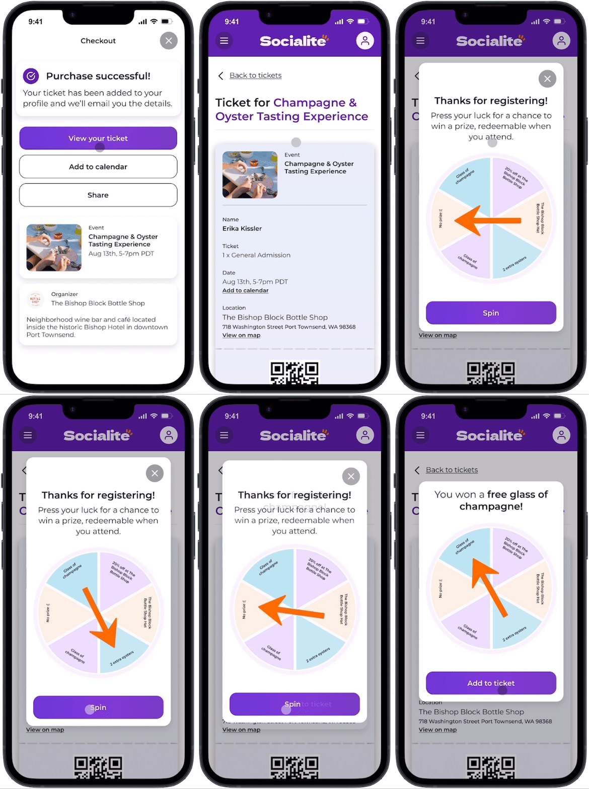
Improvement: context matters
Simplified site information architecture to host tickets within the user profile.
Provided visual context by initiating the pop-up on the ticket page to reduce confusion.
By delaying the spin-to-win pop-up until after the user clicks to view the ticket, purchase confirmation confusion was reduced by 100%.
2
Sharing options are confusing and limited
Users found the share button unclear and mistook it for an upload button or had no idea what it was for.
Three of the five users noted that it is unclear how they would share the event with friends or family from the app.
Original design
Improvement: labels save the day
The button was labeled clearly to eliminate any confusion caused by icons, making it easier for users to understand its purpose.
Made the share button sticky on the page for constant visibility on mobile and web.
4
The website CTA is weak
As the user scrolled, the "Get Tickets" button got buried under the additional content.
There was only one place to purchase tickets, which is the most important action on the screen.
Original design
Improvement: if it’s important, make it obvious
As the CTA is the most critical interaction on the page, I implemented a floating button that remains visible as the user scrolls.
Conclusion
The final product: According to user testing data, the spin-to-win feature is projected to increase conversion by 46%.
Additionally, all users agreed that the spin-to-win feature was a fun surprise!
After feedback and iterations, the final deliverables are optimized prototypes for both web and mobile platforms. The prototypes were designed to ensure a seamless user experience across multiple devices.
Mobile optimized prototype
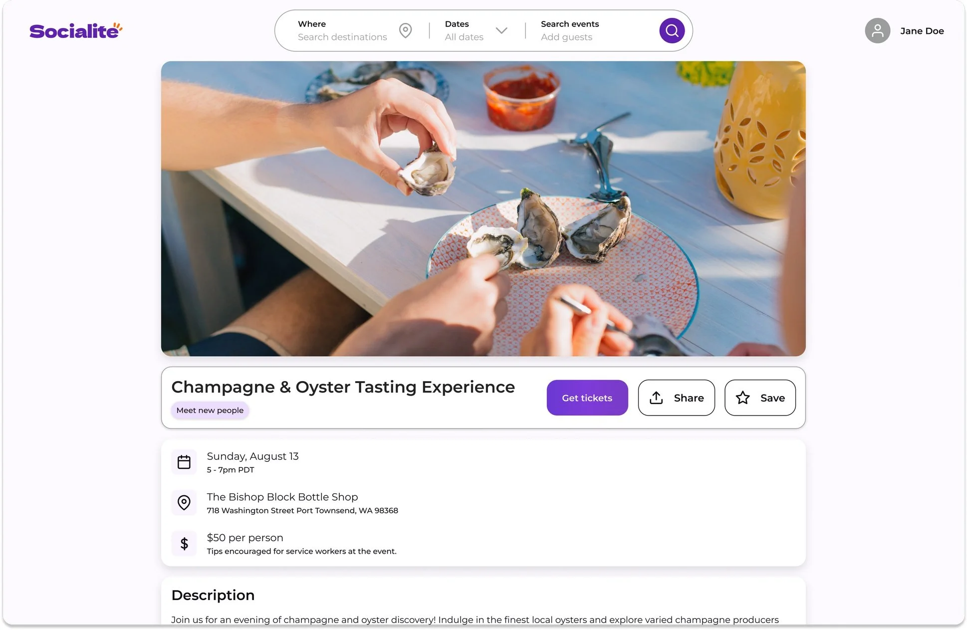
Web optimized prototype
Reflection
Sometimes, we don't get things right on the first try.
During initial user testing, I tried using card sorting to assess the hierarchy of content areas. However, I soon realized this method needed to be revised for my specific context. Despite this setback, I remained adaptable and switched to a more suitable method as testing progressed. I’ll never forget that card sorting can effectively evaluate existing information architecture, but not necessarily establish it.
I encountered limited resources and time.
If I had more time, I would have liked to involve more participants in my initial user research. However, due to time constraints, I could only speak with two target users when, ideally, I would have preferred to talk to at least five individuals. Furthermore, I would have conducted a content hierarchy study with a larger number of participants to gain a better understanding of common patterns.
Written and executed by Erika Kissler
Thanks for being here! If you’d like to talk further please reach out.


